Crafty Purple Frog Shop

Wednesday, April 27, 2022

Copic Skin colour combination No.2

 I am going to share a range of copic colour combinations and I have loaded a blank colour combination chart so that you can keep your own record of your favourite colour combinations. You can find it here or in the tab at the top of this blog. Right click the chart you want save it and then print as much as many as you need. This works best if you print it onto the card or paper you use to colour on.

This colour combination is one I like to use as a skin tone. 


This is what it looks like on this pretty lady from Stamping Bella's Curvy Girl Loves Tea stamp set.


If there is something you would like a colour combination for then please message me and I will try to come up with one for you :D


Huge hugs


Amy xx


Monday, April 18, 2022

Copic skin colour combination 1

 I am going to share a range of copic colour combinations and I have loaded a blank colour combination chart so that you can keep your own record of your favourite colour combinations. You can find it here or in the tab at the top of this blog. Right click the chart you want save it and then print as much as many as you need. This works best if you print it onto the card or paper you use to colour on.

This is the first colour combination and it is one I like to use as a skin tone. 


This is what it looks like on a super cute little lady from The Greeting Farm Bloom big kit.


If there is something you would like a colour combination for then please message me and I will try to come up with one for you :D


Huge hugs


Amy xx


Thursday, April 7, 2022

I appreciate you


 I am back again with my card for my third class for the Altenew AECP level 2. This card is from the Color your day class. This class has made me buy a colour wheel, which I think is going to be a great addition to my creative process. I have known about the colour wheel but never thought about having one by my side to be able to just quickly refer to. I absolutely LOVE colour and am a big visual person swatching all my stash so I can see how it is going to look together before I start making. This class was so much fun and I feel like I learnt a lot.

For my card I wanted to use a stamp set which is quite new to me the Altenew Garden Delights stamp set. I have to say that this set is beautiful. It was a dream to line up and I really like the little sentiments that come with it.

I wanted to use the complimentary colours for this creation while adding in the black to make them pop. I used the 70,20,10 theory where I had red for the 70, green for the 20 and black for the 10.

For the flowers I used the following Altenew Crisp dye inks:

Pastel Sunrise, Canyon Clay and Burnt Red. They are all in the Martian Terrain ink set.

The leaves are Frayed Leaf and forest Glades which are both in the Green Fields ink set.

I used the coordinating dies to cut all my leaves and flowers out.


I hand drew the black frame in and added the black centres for the flowers with Nuvo Black Board vintage drops. For a bit more red I used the splatters in the Inky Bouquet stamp set. 

To finish this card off I cut a strip of black card and embossed the sentiment from the Garden Delights set in white super fine Wow! embossing powder.

Thank you for taking the time to visit this blog.

Huge hugs

Amy xx


Bleaching with water and it is beautiful!


I am back with my next card for the Altenew AECP level 2. 

For this card I took my inspiration from the Beyond Basic Backgrounds class. I have to say I have been crafting for many years now but I absolutely loved this class! There were so many tips and techniques that I could learn from and I had so much fun making and playing with the different techniques.

But my favourite was the idea of bleaching with water. Why oh why have I not done this before?? 

I just LOVE the way it stretches your stamps as well as giving this subtle but beautiful result. I am also so impressed with how well it has kept the fine detail that is in the Altenew Quaint Blooms stamp set. I was so sure it was going to bleed over the edges and give a sort of fuzzy look. For the record you can get that look if you add more water to your stamp. It gives a different but equally beautiful look.


For this card I first blended Blueprint sketchmermaid lagoon and salvaged patina distress oxide inks all over my piece of watercolour card stock. Then using my stamping platform I lined up the Quaint blooms stamp where I wanted it and then used a sponge to apply water to the stamp. I stamped with the water about 4 times to get these images to appear this clearly. Once I had that beautiful background I did not want to cover it up too much so added the Painted Encouragement stamp set which I embossed with Gold super fine Wow! embossing powder. Before finishing it off with a few sparkly gems.

I hope you can try this technique out for yourself and I can really recommend taking the class to find out all of the other hints and techniques :D

Thank you so much for visiting this blog
Huge hugs

Amy xx


Beautiful Details


I am so happy to be able to say that I have made it through Level 1 of the Altenew AECP and so now am moving onto level 2. There are so many amazing classes to work through for this level 2 certificate I wasn't sure where I wanted to start so I have gone in alphabetical order :D 

So my first creation for you is from all my learning in the brilliant Beautiful Details class. If you have not seen Altenew have a whole range of great online craft classes where you can learn so many tips and techniques to use in your crafting. You can find them all HERE and there are some free ones if you want to see what the classes are like so what have you got to lose??


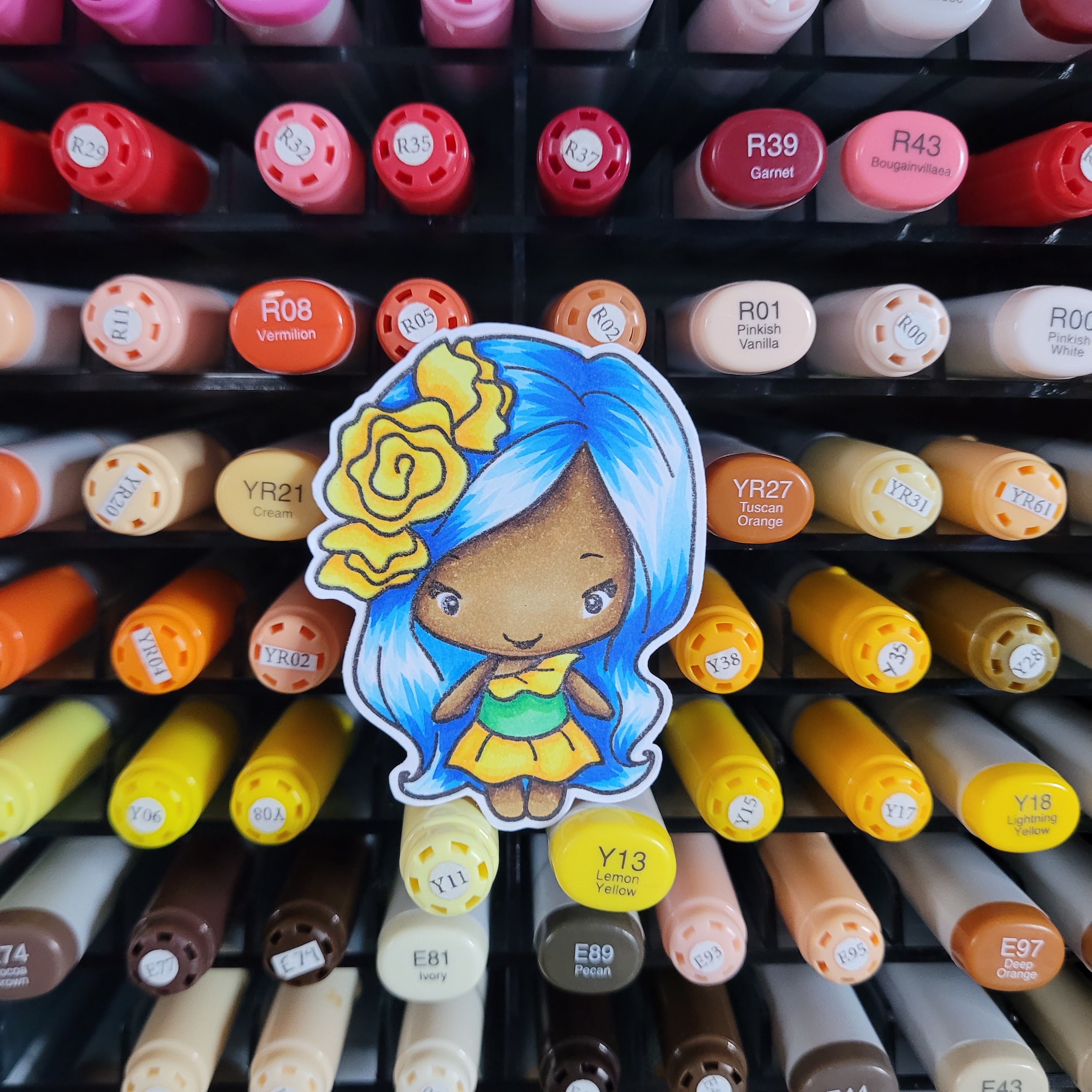
I had so much fun making this card. I was so inspired by the idea of mixing up the media I use to colour that I went all in and for this card I have used Copics, Faber-Castell pencils and Altenew watercolours. I am not sure why I haven't combined the mediums I use before now.

I am so happy with the depth and detail that this had added to this beautiful Altenew Tulip stamp set.


I stamped my images on watercolour paper as I new I wanted to use the Altenew watercolour essentials set. I wanted to try and keep some of that watercolour lose look so I did some second generation stamping with Versafine Smokey gray ink to give a really light outline for a no line colouring look.


I started by using water colours to give a base and some depth. I followed that with using some pencils to add some more texture and detail. To finish the colouring and add even more depth I also added some copics into the mix. Lastly I added the splatters with the watercolours and then the sentiment that is in the Tulip stamp set.


I hope this helps inspire you to mix up your colouring and add in details to make your stamped images your own and give that truly handmade touch to your projects. I have no doubt that I will be using the many techniques I learnt in this class over and over again. I am totally inspired.

Thank you for taking the time to visit this blog

Huge hugs to you all 

Amy xx

National Teen Self Esteem hop 2023

This is my card I have created for the Instagram  #nationalteenselfesteemhop23 A great group of crafters have come together to spread love, ...